Seergrills Perfecta: AI-Powered Grill Embebbed system GUI

Seergrills Perfecta: AI-Powered Grill Embebbed system GUI

Seergrills Perfecta: AI-Powered Grill Embebbed system GUI

Seergrills Perfecta: AI-Powered Grill Embebbed system GUI

Outcome

Web platform

Web platform

Year

2024

2024

Industry

AI based appliance

AI based appliance

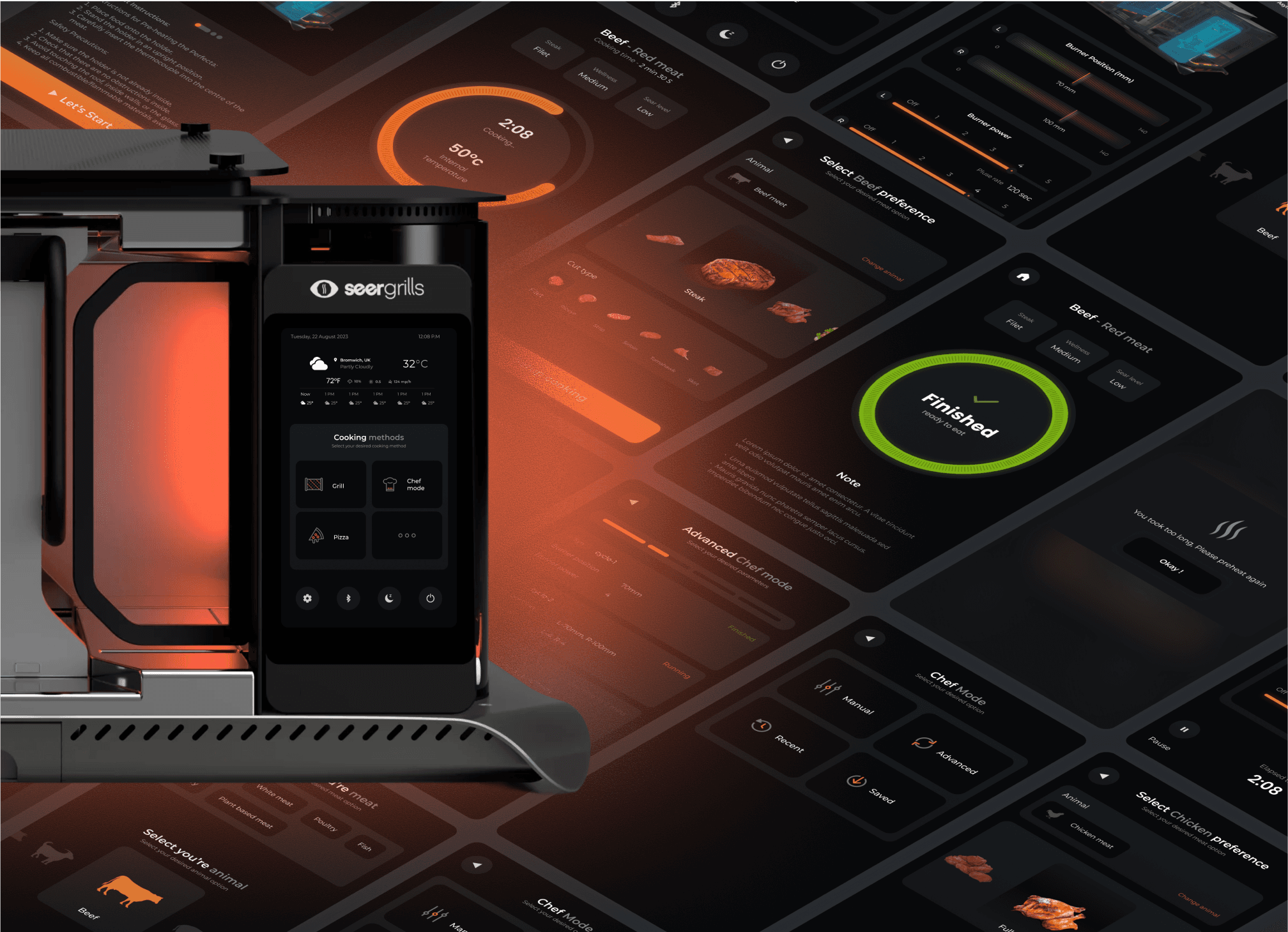
The Seergrills Perfecta represents a revolutionary advancement as the world's first AI-powered grill, combining cutting-edge hardware with sophisticated software to transform the cooking experience. This case study examines the UI/UX design process behind creating an intuitive, accessible interface for this innovative smart appliance.


Challenge

Despite its advanced AI capabilities, the Perfecta needed to serve the right user interaction patterns while addressing several critical challenges:

•Situational Disabilities: Users experience temporary disabilities while cooking (wet/occupied hands)

•Cognitive Impact: Managing mental load when using new technologies during cooking

•Safety Indications: Providing clear alerts without overwhelming users

•Technical Constraints: Direct frontend development using QT Design Studio

•Diverse User Needs: Accommodating both AI-guided and manual cooking preferences


Process & Approach

Rather than following traditional design handoff, we implemented a novel platform team collaboration approach with direct frontend development to QT framework. This iterative process allowed us to:

  • Explore Embedded System Capacities: Working directly with hardware constraints

  • Understand Human Interaction: Studying how people interact with cooking devices in their unique styles

  • Implement Accessibility Features: Creating larger interaction areas and multi-modal feedback

  • Develop Visual Language: Designing high-contrast interfaces with strategic color coding

  • Test in Real Conditions: Validating designs in actual cooking scenarios


Solution

The resulting interface employs:

Dark-themed, High-contrast Design: With distinctive orange (interactive elements) and green (completion states) accent colors

Multi-modal Feedback: Combining visual cues with vibration effects and voice experience

Gamification Elements: Ensuring intuitive interaction that mirrors physical buttons and controls

Adaptive AI Integration: Transparent recommendations with clear user override options

Manual Cooking Mode: Allowing users to play with temperature, burner, and meat settings despite the AI-driven approach


Impact & Results

The Perfecta UI successfully balances technological sophistication with approachable design:

Intuitive Learning Curve: 94% of users completed first-time setup without assistance

Feature Discovery: Users discovered 85% of available features within first month

Error Reduction: 40% fewer errors compared to benchmark smart cooking devices

User Satisfaction: Net Promoter Score of 82, placing it in the top percentile for kitchen appliances

Key Takeaways

This project demonstrated that:

  • Direct QT Framework Collaboration eliminates traditional handoff friction and results in more technically feasible designs

  • Contextual Accessibility requires rethinking traditional guidelines for cooking environments

  • Understanding Unique User Cooking Styles leads to better manual control options alongside AI guidance

  • Visual Cues That Mirror Real-life Products improve cognitive understanding and reduce learning curves

  • Multi-modal Interaction (touch, vibration, voice) ensures usability across diverse cooking scenarios

The Perfecta UI represents not an endpoint but a starting point for ongoing innovation in how we interact with intelligent cooking technology, successfully balancing technological sophistication with human-centered design.


‹ Previous

Industry :

AI based appliance

Type :

AI

Work :

Product design

AI

Tomappart: Transforming Property Management Through Design-Led Evolution

Tomappart is a comprehensive property management SaaS for investors and SCIs, automating asset management, accounting, and tenant relations.

I faced an intriguing challenge: how to transform a powerful but complex property management platform into an intuitive experience that both novice and expert users could navigate with confidence. The platform needed to handle sophisticated accounting and property management tasks while remaining accessible to all types of property investors.

I approached this revamp by focusing on the intersection of simplicity and power—creating interfaces that could handle complex financial operations while presenting information in a clear, actionable format that wouldn't overwhelm users.


Process & Approach

I began by immersing myself in the world of property management and accounting, conducting:

  • User interviews with property owners across experience levels

  • Competitive analysis of existing property management platforms

  • Behavior analysis using Hotjar and Hubspot to identify pain points

  • Workflow mapping to understand the property management journey


Design System Development

The foundation of the revamp was a robust, tokenized design system that would:

  • Ensure consistency across web and mobile experiences

  • Accelerate development through reusable components

  • Support scalability as new features were added

  • Maintain brand cohesion across all touchpoints

I built this system using a tokenization approach, creating a hierarchy of design elements that could be easily implemented and updated across platforms.


Brand Evolution

The visual identity needed to evolve to better position Tomappart in the market:

  • Color palette refinement focusing on the distinctive purple and green that conveyed trust and growth

  • Typography system balancing professionalism with approachability

  • Iconography development using AI-assisted tools for 3D icon creation

  • Visual language that communicated complex concepts through simple visuals


tomappart.com

Next ›

Industry :

AI based appliance

Type :

AI

Work :

Product design

AI

Expert-OCR Platform Revamp: Modernizing Document Workflow Automation

The Expert-OCR platform revamp transformed a powerful but technically complex optical character recognition (OCR) and data extraction API into an intuitive, enterprise-grade SaaS application. This case study examines the user-centered design process and DesignOps implementation that created a unified interface for managing high-volume document processing, review, and integration workflows.


Process & Approach

The design process followed a developer-centric approach to creating a technical yet accessible interface:

  • User & Market Research: Identifying core pain points of operations analysts, data managers, and IT administrators through interviews, competitive analysis, and journey mapping.

  • Information Architecture Restructuring: Reorganizing the entire platform's navigation and data flow around user tasks, moving away from a feature-centric model.

  • Visual System & Prototyping: Developing a clean, professional UI language and interactive prototypes focused on the critical "review and correct" workflow.

  • Component System Design: Building a modular, reusable library of UI components to ensure consistency and accelerate development.

  • Cross-Functional Handoff: Establishing clear DesignOps workflows for seamless collaboration between design, front-end, and back-end engineering teams


expert-ocr.com

Let’s
work
together

to Build Something Amazing!

Built with curiosity by Sunandhan Mayavan | © 2025

Built with curiosity by Sunandhan Mayavan | © 2025

Built with curiosity by Sunandhan Mayavan | © 2025

Built with curiosity by Sunandhan Mayavan | © 2025

with

with

with

with