Invisibl Cloud: Branding

Invisibl Cloud: Branding

Invisibl Cloud: Branding

Invisibl Cloud: Branding

Outcome

Web platform

Web platform

Year

2024

2024

Industry

cloud computing

cloud computing

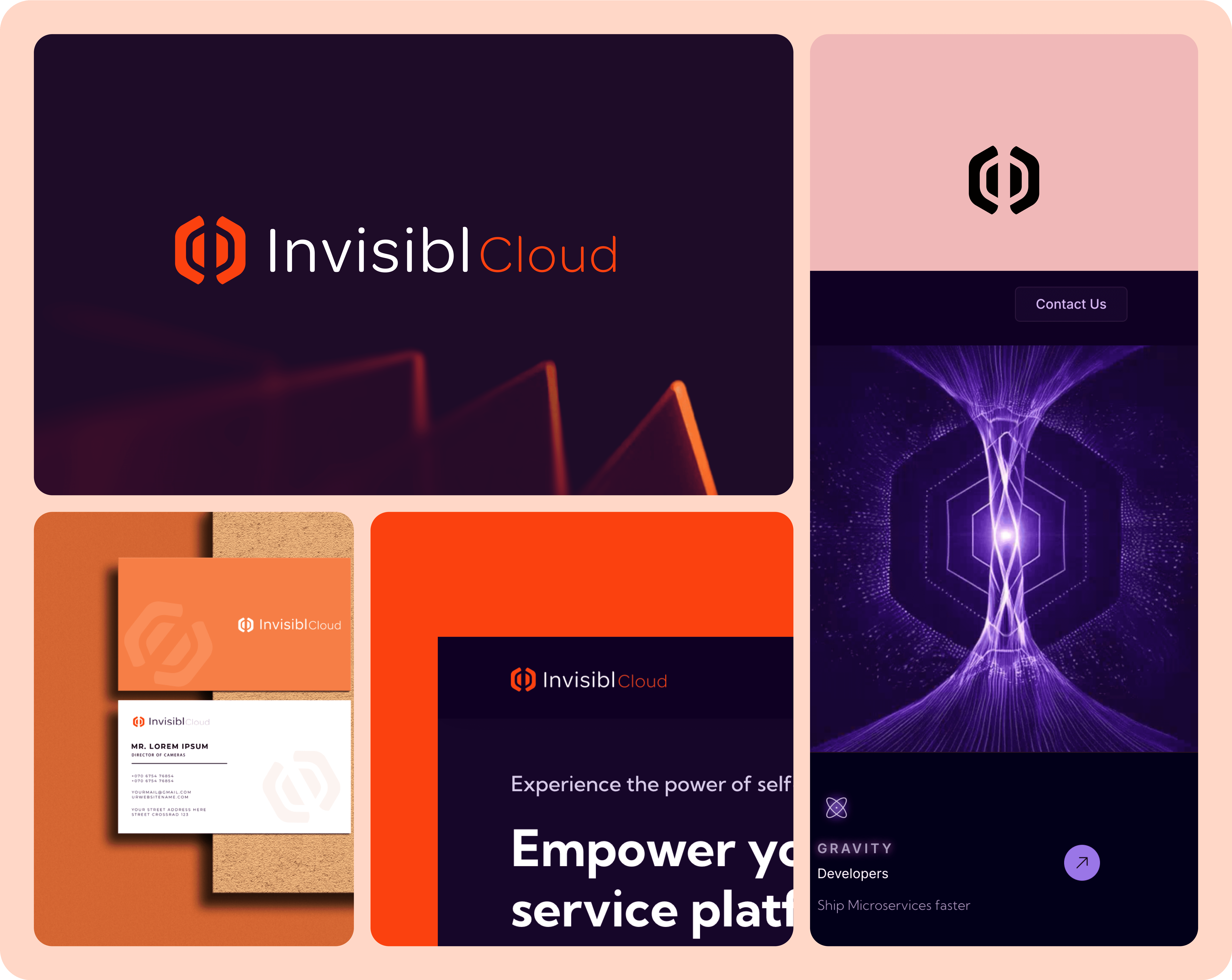
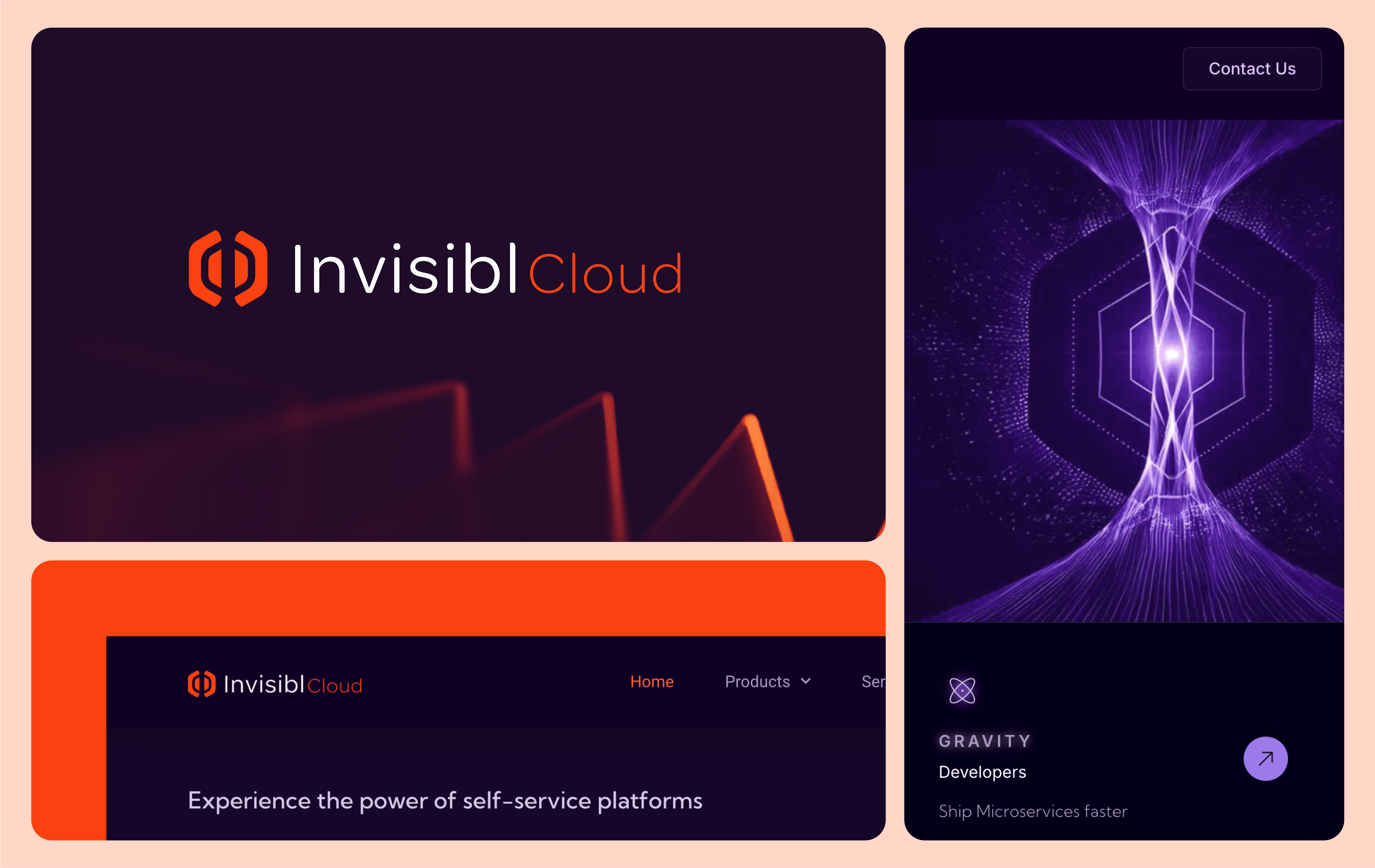
Invisibl Cloud represents a sophisticated branding solution for a cloud-based management system that makes the invisible infrastructure of cloud computing visible and accessible. This case study examines the strategic design decisions behind creating a distinctive visual identity that communicates technical precision while maintaining visual appeal.

Process & Approach

The design process followed a methodical approach to brand development:

1.Conceptual Exploration: Investigating the duality of visible/invisible through geometric forms

2.Mathematical Precision: Applying golden ratio proportions and grid-based construction

3.Symbolic Integration: Incorporating industry references (Kubernetes hexagon) and letter forms

4.Color Psychology: Selecting a vibrant orange-red against deep indigo to create visual impact

5.Typography Selection: Pairing clean sans-serif with weight variation to enhance brand personality


Brand Symbol Story

The Invisibl symbol embodies multiple conceptual layers:

•Parent Brand Architecture: Invisibl functions as a parent brand with umbrella products beneath it (Gravity, Quark, Ather, etc.), all representing forces from invisible forms

•Negative Space "i": The central negative space deliberately forms the letter "i" from Invisibl, creating meaning through absence

•Magnetic Wave Representation: The hexagonal elements symbolize the domain's nature and the force of electromagnetic auras

•Force Field Visualization: The circular elements suggest magnetic or force fields, reinforcing the concept of invisible power made visible

Solution

The resulting brand identity features:

•Distinctive Logo Mark: A symmetrical emblem combining parenthesis-like forms with negative space creating the letter "i"

•Color Strategy: Vibrant orange-red (near true red) to dominate among other house brands, conveying energy, innovation, and visibility

•Typographic System: Modern sans-serif with balanced weight distribution between "Invisibl" and "Cloud"

•Geometric Construction: Precise mathematical relationships with clear grid alignment and proportional spacing

•Symbolic Layers: Multiple interpretations including force fields, connectivity, and data flow visualization

Impact & Results

The Invisibl Cloud branding successfully achieves:

•Immediate Recognition: Distinctive form creates instant brand recall in competitive market

•Conceptual Clarity: Visual elements directly communicate the brand's core promise

•Technical Authority: Precise construction establishes credibility in the technical space

•Versatile Application: Identity system works effectively across digital interfaces and marketing materials

•Scalable System: Brand elements can expand as the product offering grows

Key Aesthetic Insights

This project demonstrates several important branding principles:

1.Negative Space as Positive Design: The most powerful element is what isn't there—the negative space forming the "i"

2.Mathematical Beauty: Geometric precision creates an inherent sense of harmony and trustworthiness

3.Symbolic Layering: Multiple levels of meaning create depth without visual complexity

4.Color Psychology: Strategic use of dominant red-orange creates energy and establishes hierarchy within the brand family

5.Conceptual Alignment: Every design decision reinforces the core brand promise of making the invisible visible

The Invisibl Cloud identity exemplifies how thoughtful branding can transform abstract technical concepts into visually compelling and meaningful experiences that resonate with both technical and non-technical audiences.

‹ Previous

Industry :

AI based appliance

Type :

AI

Work :

Product design

AI

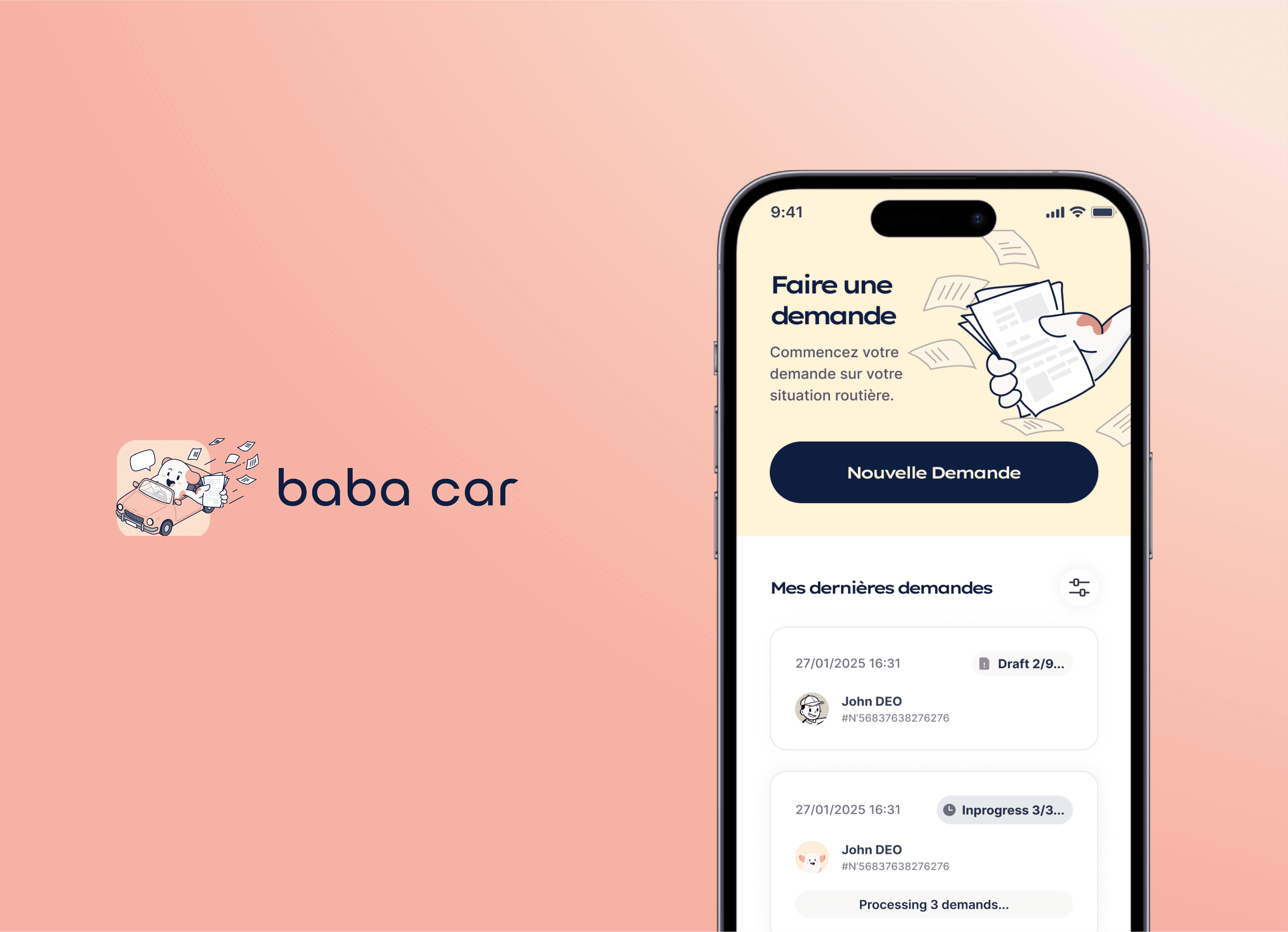
Baba-Car Mobile App: Simplifying Traffic Fine Management in France

Baba-Car is a mobile application designed to remove the complexity and anxiety from managing traffic fines for drivers in France. This case study examines the user-centered design process that transformed a fragmented, bureaucratic procedure involving multiple regional prefectures into a single, streamlined digital service. The core challenge was designing a trustworthy experience that handles sensitive personal data and legal authorization with clarity and ease


Process & Approach

The design process was anchored in simplifying a known stressful administrative task, focusing on transparency and user guidance.

  1. Problem Validation & User Research: The design started from a well-defined user pain point: the difficulty of manually checking for forgotten fines across multiple French départements, which can lead to costly fee increases. User interviews confirmed anxiety over missing mail and confusion about which prefecture to contact.

  2. Task Analysis & Journey Mapping: The complex bureaucratic process was deconstructed into a linear, user-controlled flow. Each step was designed to request only the essential information needed to execute the legal inquiry on the user's behalf.

  3. Trust-Centered Interface Design: A primary focus was building instant user trust. The UI employs clear language, explains the purpose of each step (especially the legal mandate signature), and emphasizes data security.

  4. Clarity-First Prototyping: Wireframes and prototypes prioritized a minimal, step-by-step wizard. The goal was to make a process that normally takes hours of research and phone calls completable in "less than 5 minutes".

  5. Compliance-Integrated Design: Legal and data privacy requirements (like GDPR) were not afterthoughts but core design constraints, shaping the flow for submitting ID copies and signing digital mandates.

baba-car.fr

Next ›

Industry :

AI based appliance

Type :

AI

Work :

Product design

AI

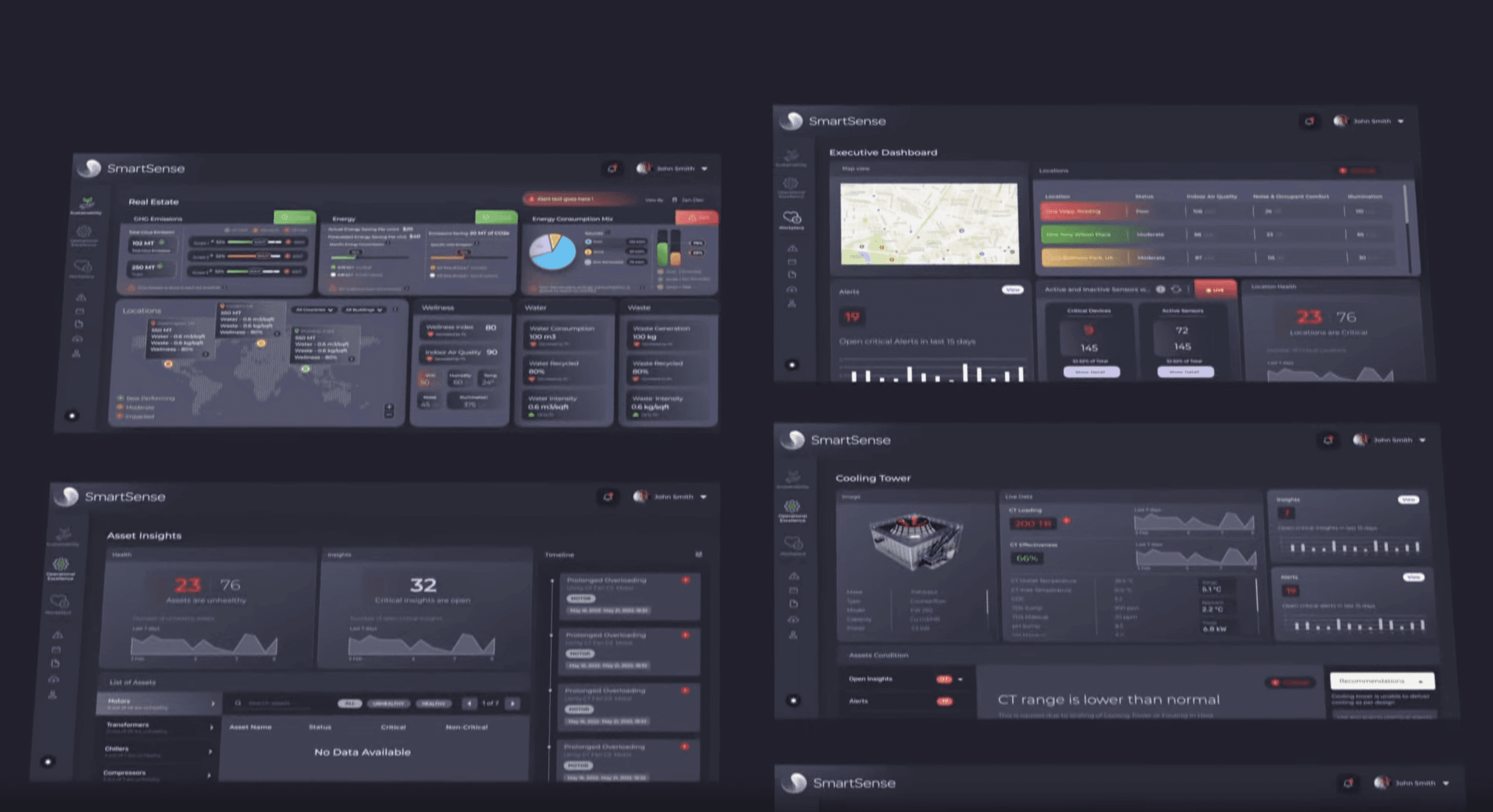
Ecolibrium SmartSense: Data Visualization UI/UX

Ecolibrium SmartSense is an AI/ML-powered decarbonization platform that transforms complex sustainability data into actionable insights through an intuitive dashboard interface. This case study examines the UI/UX design and DesignOps processes that created a unified visualization system for monitoring environmental impact across entire building portfolios.


Process & Approach

The design process followed a systematic approach to creating a complex data visualization interface:

User Research: Identifying the needs of sustainability managers, facility operators, and executive stakeholders

Information Architecture: Structuring complex environmental data into logical, accessible hierarchies

Visual System Development: Creating a cohesive design language optimized for data comprehension

Component Design: Building a modular system of UI components for consistent implementation

Cross-Functional Integration: Establishing DesignOps workflows for seamless collaboration with development

ecolibrium.io

Let’s
work
together

to Build Something Amazing!

Built with curiosity by Sunandhan Mayavan | © 2025

Built with curiosity by Sunandhan Mayavan | © 2025

Built with curiosity by Sunandhan Mayavan | © 2025

Built with curiosity by Sunandhan Mayavan | © 2025

with

with

with

with