Outcome
Year
Industry
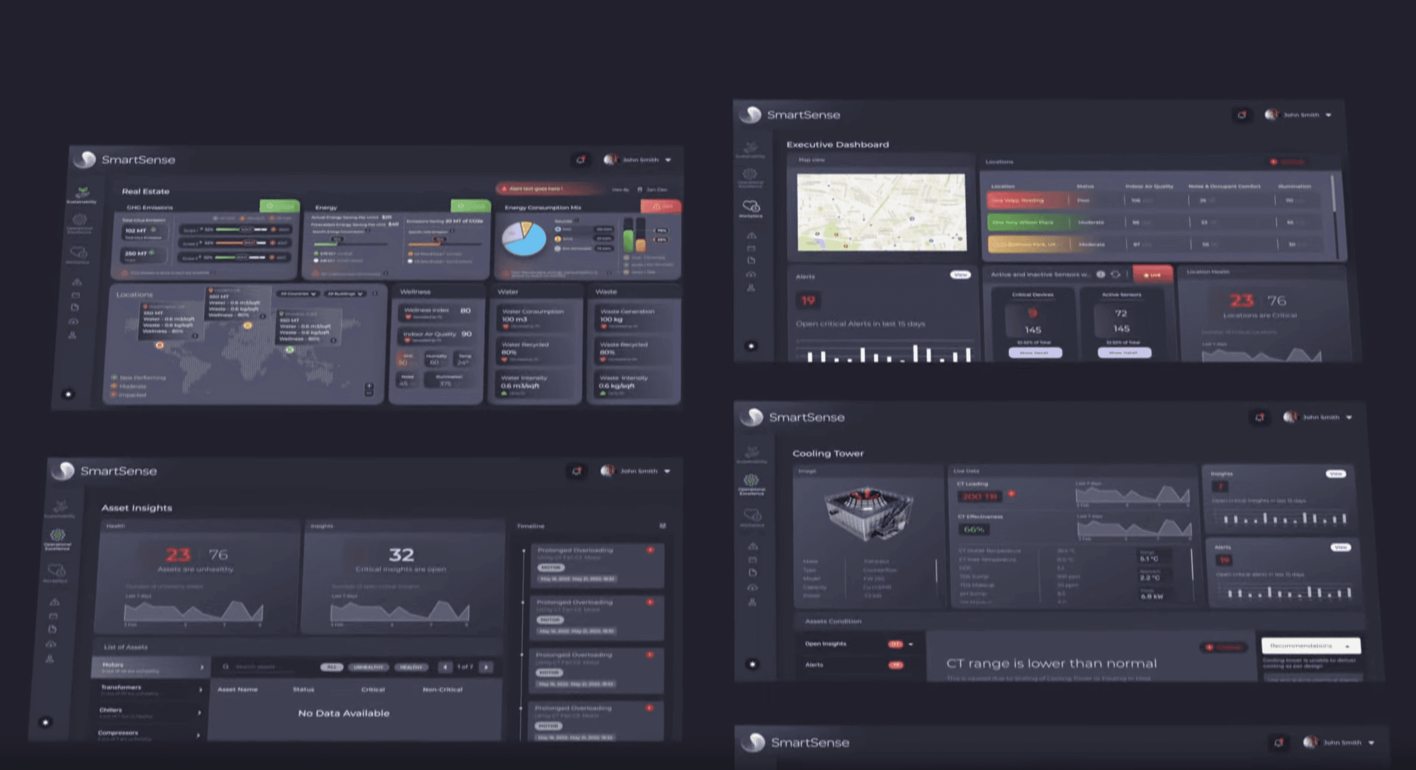
Ecolibrium SmartSense is an AI/ML-powered decarbonization platform that transforms complex sustainability data into actionable insights through an intuitive dashboard interface. This case study examines the UI/UX design and DesignOps processes that created a unified visualization system for monitoring environmental impact across entire building portfolios.
Process & Approach
The design process followed a systematic approach to creating a complex data visualization interface:
• User Research: Identifying the needs of sustainability managers, facility operators, and executive stakeholders
• Information Architecture: Structuring complex environmental data into logical, accessible hierarchies
• Visual System Development: Creating a cohesive design language optimized for data comprehension
• Component Design: Building a modular system of UI components for consistent implementation
• Cross-Functional Integration: Establishing DesignOps workflows for seamless collaboration with development
Design System Story
The SmartSense interface embodies multiple conceptual layers:
• Triple Bottom Line Framework: The UI is organized around the "People, Planet, Profit" sustainability model, with dedicated visualization modules for each dimension
• Data Narrative Structure: Each dashboard tells a story through progressive disclosure, from high-level KPIs to detailed analytics
• Visual Hierarchy System: Information is prioritized through consistent sizing, positioning, and color-coding to guide user attention
• Contextual Intelligence: The interface adapts to present the most relevant insights based on user role and current focus
Solution
The resulting interface features:
Dark-Themed Dashboard: High-contrast dark mode optimized for extended monitoring sessions and reduced eye strain
Card-Based Architecture: Modular information cards that can be configured and arranged based on user priorities
Multi-Modal Visualization: Diverse chart types (line graphs, maps, pie charts, progress indicators) unified by consistent styling
Color Strategy: Strategic use of purple brand elements with a supporting palette optimized for data differentiation
Responsive Layout: Adaptive grid system ensuring consistent experience across device sizes and orientations
DesignOps Implementation
The project established robust DesignOps practices:
• Component Library: Comprehensive UI kit with standardized elements ensuring visual and functional consistency
• Design-Development Handoff: Streamlined process documentation reducing implementation friction
• UI Guidelines: Detailed specifications for spacing, typography, color usage, and interactive states
• Version Control: Systematic approach to component updates maintaining design integrity over time
• Cross-Functional Workflow: Collaborative processes integrating design, development, and data science teams
Impact & Results
The SmartSense UI/UX design successfully achieves:
• Cognitive Load Reduction: Complex sustainability data made accessible through intuitive visualization
• Decision Support: Clear insights enabling faster, more informed sustainability decisions
• Cross-Stakeholder Alignment: Common visual language bridging technical and executive perspectives
• Implementation Efficiency: Streamlined DesignOps reducing development time and inconsistencies
• Platform Scalability: Modular system supporting ongoing feature expansion and refinement
Key Aesthetic Insights
This project demonstrates several important UI/UX principles:
Data Density Balance: Maximizing information value while minimizing visual complexity
Functional Beauty: Visual design that enhances rather than competes with data comprehension
System Thinking: Approaching interface design as an integrated ecosystem rather than isolated screens
Operational Integration: Embedding DesignOps practices throughout the development lifecycle
Accessibility Through Design: Making complex sustainability metrics understandable to diverse stakeholders
The Ecolibrium SmartSense interface exemplifies how thoughtful UI/UX design and systematic DesignOps can transform complex data into accessible insights, ultimately supporting better environmental decision-making across building portfolios.