Outcome
Year
Industry
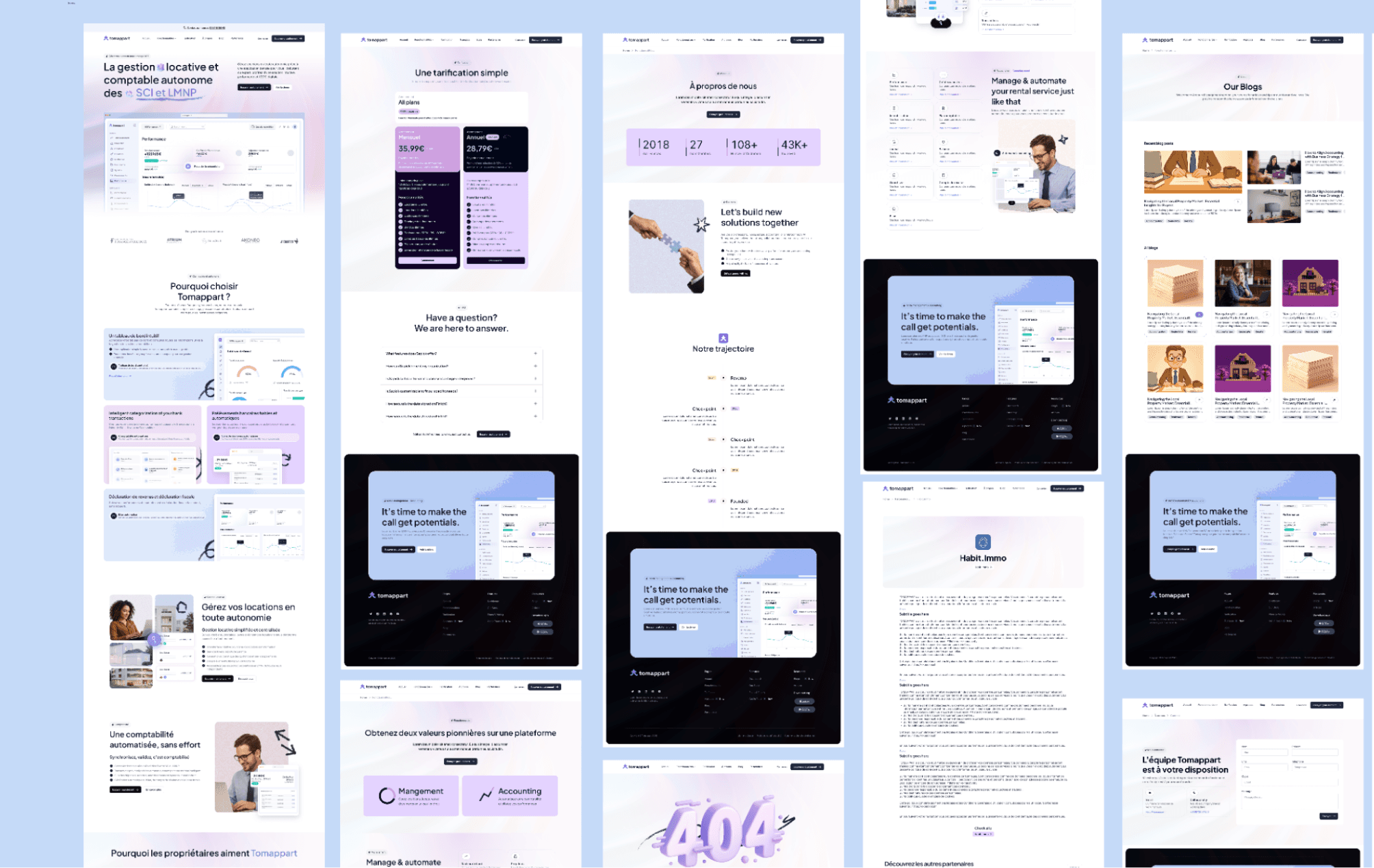
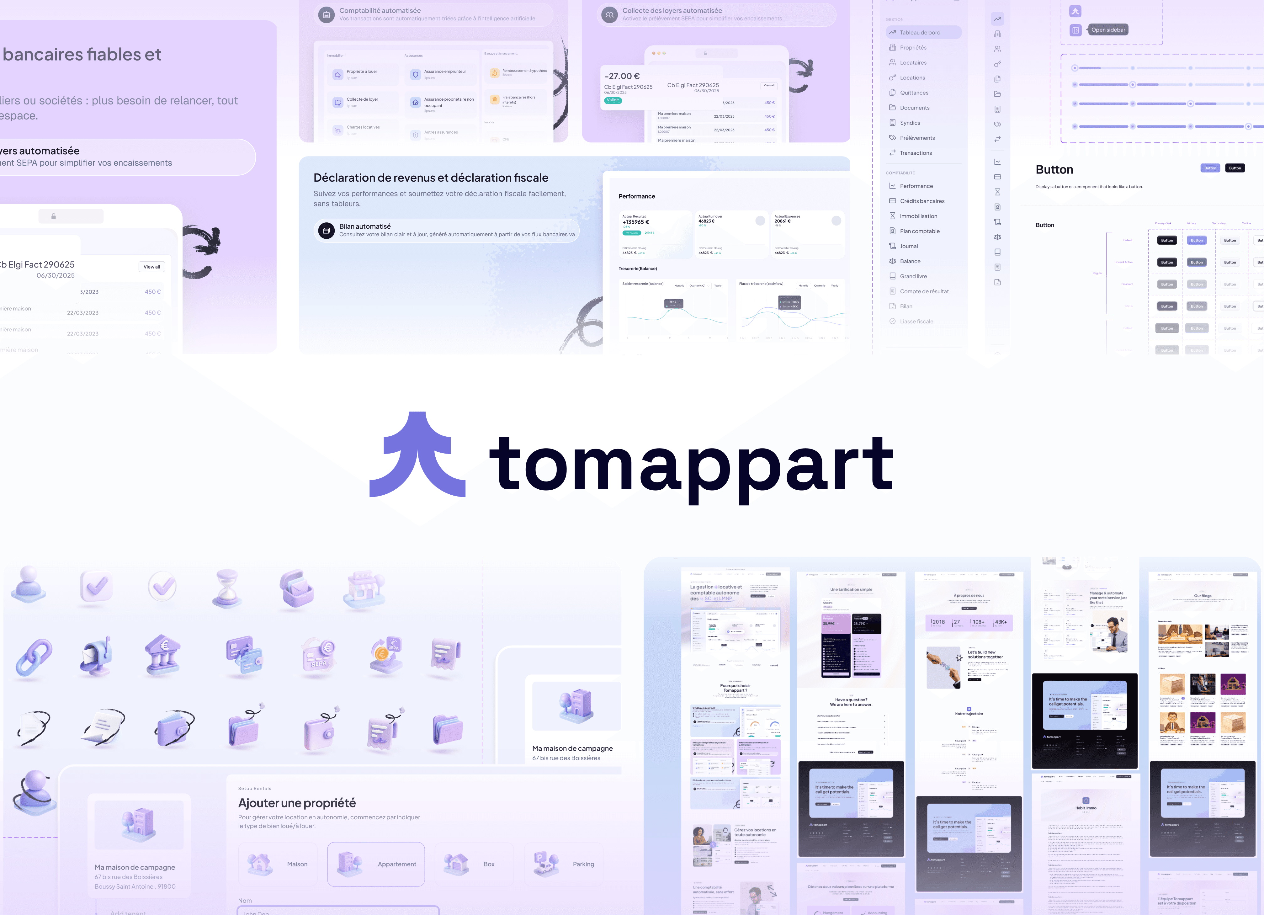
Tomappart is a comprehensive property management SaaS for investors and SCIs, automating asset management, accounting, and tenant relations.
I faced an intriguing challenge: how to transform a powerful but complex property management platform into an intuitive experience that both novice and expert users could navigate with confidence. The platform needed to handle sophisticated accounting and property management tasks while remaining accessible to all types of property investors.
I approached this revamp by focusing on the intersection of simplicity and power—creating interfaces that could handle complex financial operations while presenting information in a clear, actionable format that wouldn't overwhelm users.
Process & Approach
I began by immersing myself in the world of property management and accounting, conducting:
User interviews with property owners across experience levels
Competitive analysis of existing property management platforms
Behavior analysis using Hotjar and Hubspot to identify pain points
Workflow mapping to understand the property management journey
Design System Development
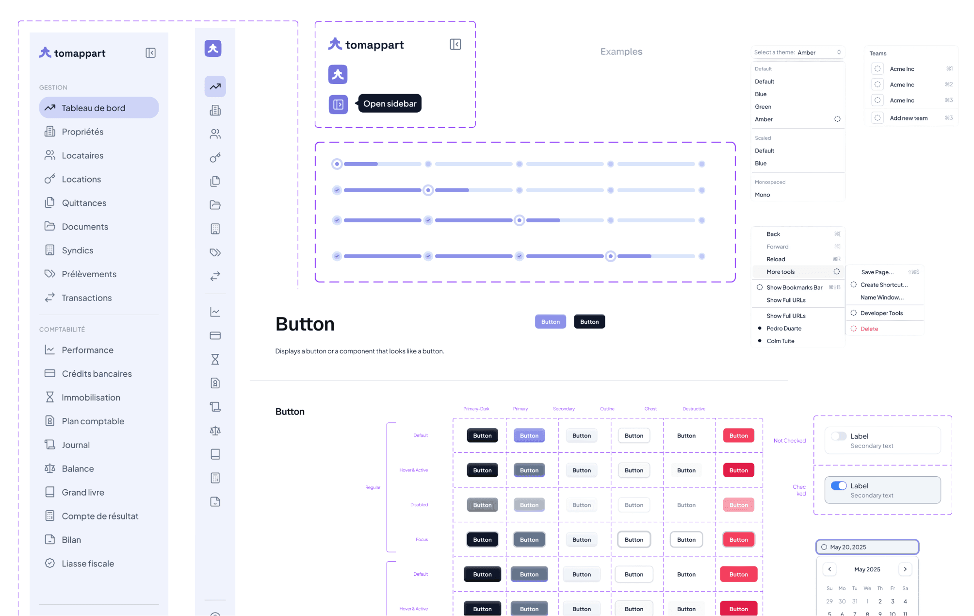
The foundation of the revamp was a robust, tokenized design system that would:
Ensure consistency across web and mobile experiences
Accelerate development through reusable components
Support scalability as new features were added
Maintain brand cohesion across all touchpoints
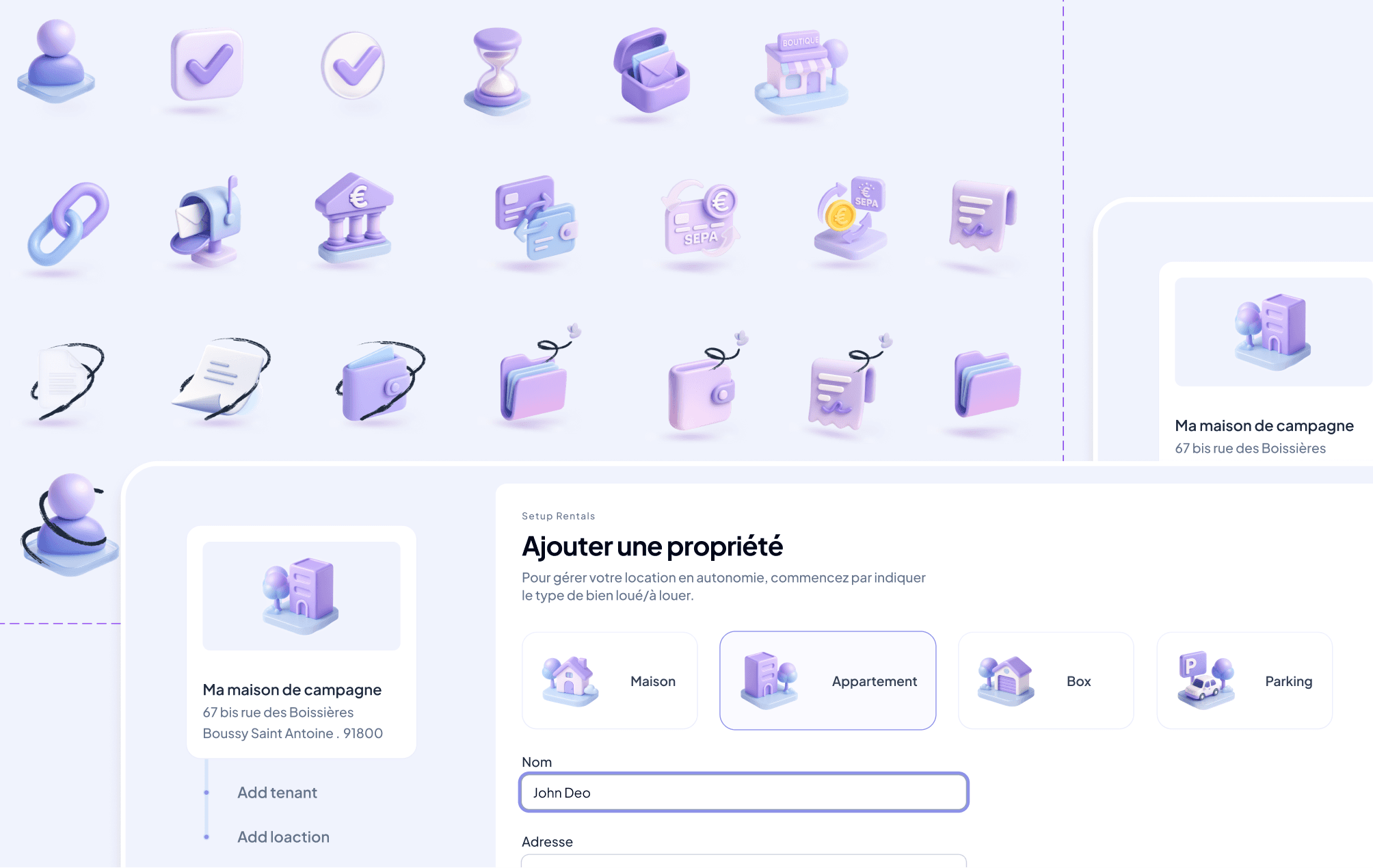
I built this system using a tokenization approach, creating a hierarchy of design elements that could be easily implemented and updated across platforms.
Brand Evolution
The visual identity needed to evolve to better position Tomappart in the market:
Color palette refinement focusing on the distinctive purple and green that conveyed trust and growth
Typography system balancing professionalism with approachability
Iconography development using AI-assisted tools for 3D icon creation
Visual language that communicated complex concepts through simple visuals
The Challenge
Tomappart faced several critical design challenges that needed to be addressed:
Property management software typically suffers from feature bloat and overwhelming interfaces
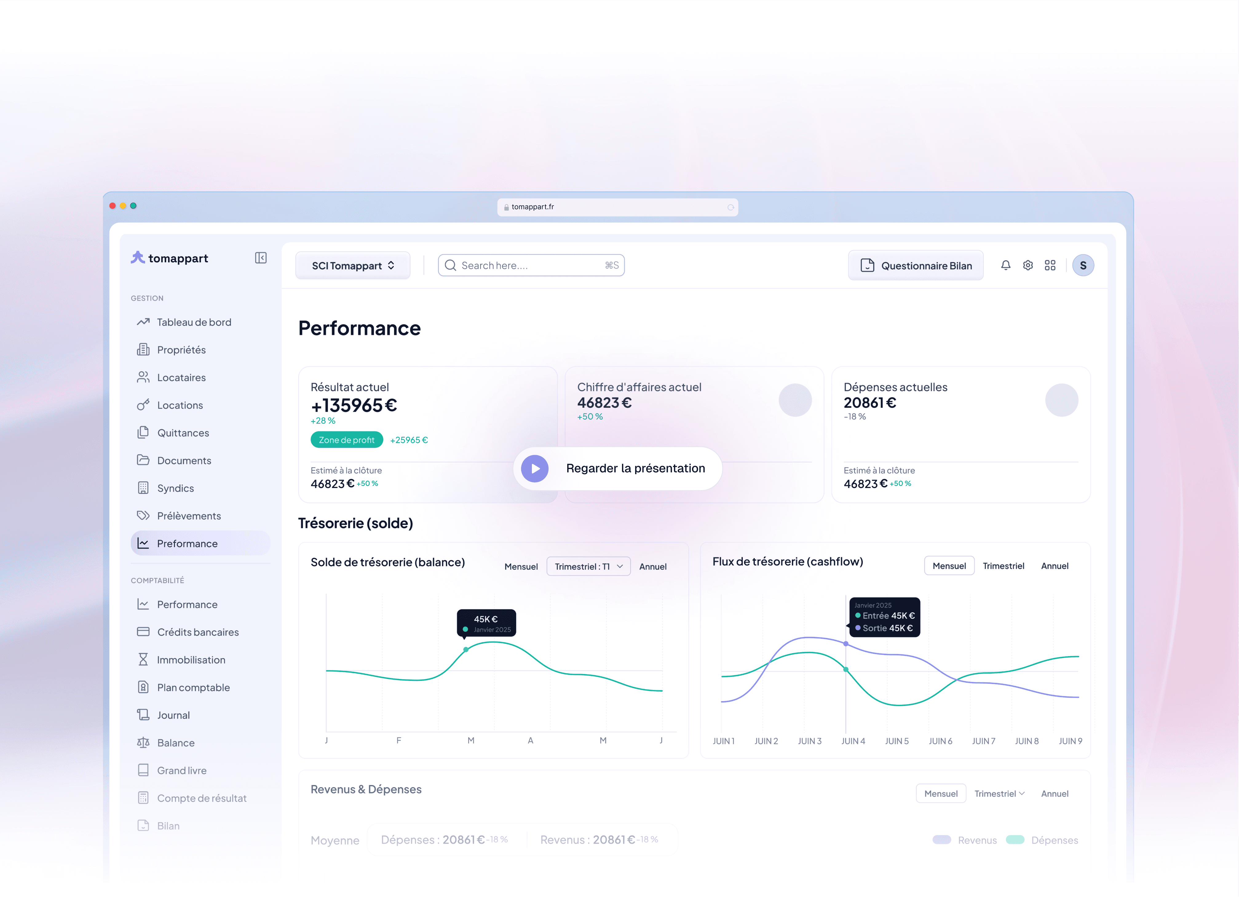
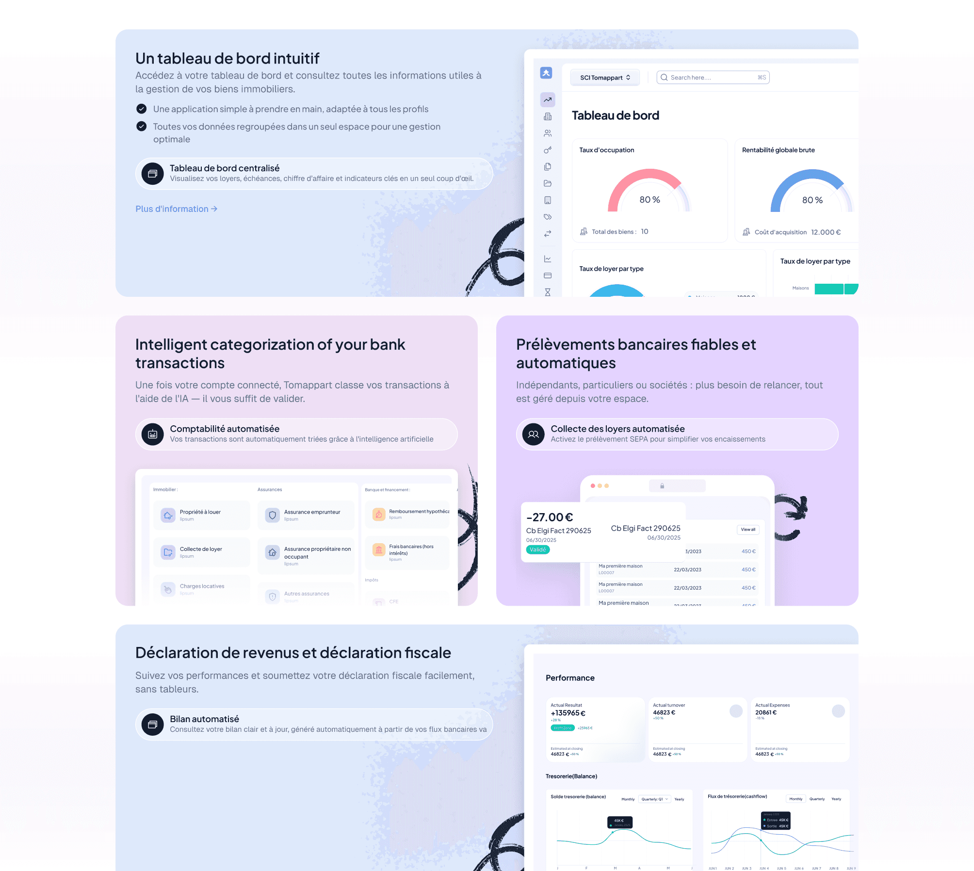
Financial data visualization needed to be both comprehensive and comprehensible
The platform served diverse users from individual LMNP owners to professional SCI managers
The brand needed stronger positioning in the competitive "Gestion Locative" market
Design workflows were inefficient, slowing down iteration and feature delivery
Solution
AI-Enhanced Workflows
I introduced AI tools to accelerate both design and user workflows:
Used Figma Buzz for rapid marketing collateral creation
Implemented AI-assisted 3D iconography generation
Created automated data visualization templates
Developed smart categorization for financial transactions
Iterative Development
The platform evolved through continuous improvement:
Regular user testing sessions
Behavior analysis using Hotjar
A/B testing of key interface elements
Rapid prototyping and validation cycles via Figma make impacts conversion hours.
Key Aesthetic Insights
This project demonstrates several important UI/UX principles:
Simplicity Without Sacrifice: Creating intuitive interfaces that don’t compromise on functionality
Progressive Complexity: Revealing advanced features only when users need them
Visual Consistency: Building trust through predictable interface patterns
Data Storytelling: Transforming raw numbers into meaningful insights
Design System Thinking: Creating scalable foundations that support rapid iteration
The Tomappart revamp demonstrates how thoughtful design can transform complex property management tasks into accessible, even delightful experiences—proving that financial software can be both powerful and approachable when user needs drive the design process.