Outcome
Year
Industry
Baba-Car is a mobile application designed to remove the complexity and anxiety from managing traffic fines for drivers in France. This case study examines the user-centered design process that transformed a fragmented, bureaucratic procedure involving multiple regional prefectures into a single, streamlined digital service. The core challenge was designing a trustworthy experience that handles sensitive personal data and legal authorization with clarity and ease
Process & Approach
The design process was anchored in simplifying a known stressful administrative task, focusing on transparency and user guidance.
Problem Validation & User Research: The design started from a well-defined user pain point: the difficulty of manually checking for forgotten fines across multiple French départements, which can lead to costly fee increases. User interviews confirmed anxiety over missing mail and confusion about which prefecture to contact.
Task Analysis & Journey Mapping: The complex bureaucratic process was deconstructed into a linear, user-controlled flow. Each step was designed to request only the essential information needed to execute the legal inquiry on the user's behalf.
Trust-Centered Interface Design: A primary focus was building instant user trust. The UI employs clear language, explains the purpose of each step (especially the legal mandate signature), and emphasizes data security.
Clarity-First Prototyping: Wireframes and prototypes prioritized a minimal, step-by-step wizard. The goal was to make a process that normally takes hours of research and phone calls completable in "less than 5 minutes".
Compliance-Integrated Design: Legal and data privacy requirements (like GDPR) were not afterthoughts but core design constraints, shaping the flow for submitting ID copies and signing digital mandates.
Design System Story
The Baba-Car interface is built on principles of simplicity, guidance, and trust for a sensitive service.
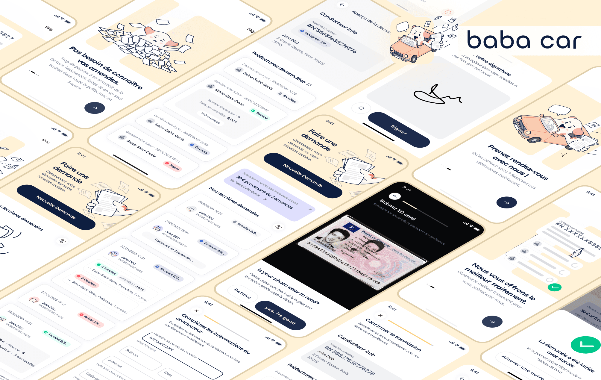
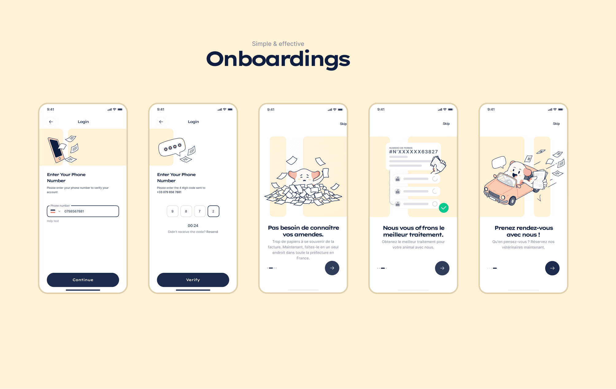
Linear Process Framework: The UI is rigidly organized around a single, clear journey: Inform, Authorize, Specify, Notify. This linear progression reduces cognitive load and clearly communicates progress.
Progressive Data Disclosure: The app requests information only when contextually needed. Personal details are collected first, followed by ID verification, then the selection of relevant departments, avoiding a overwhelming initial form.
Transactional Trust Architecture: Every screen is designed to build the credibility necessary for a user to share sensitive data. This includes clear value propositions, security reassurances, and explicit explanations for permissions like the mandate.
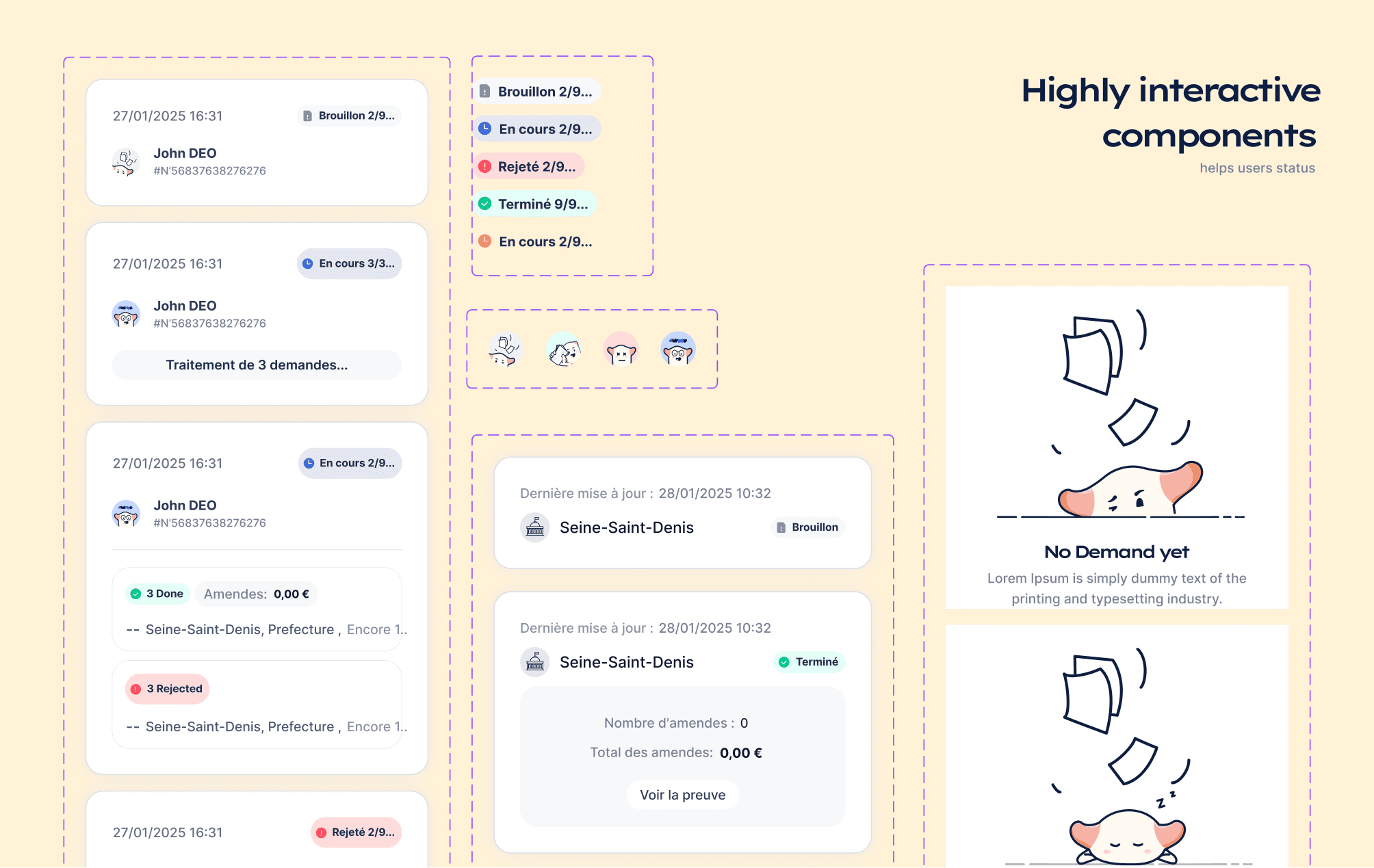
Status-Driven Communication: The post-submission experience shifts from an active task to passive waiting. The design provides clear confirmation and sets expectations for response times, with notifications as the primary re-engagement trigger.
Solution
The delivered solution is a focused utility app that executes one complex service with extreme simplicity.
Guided 4-Step Wizard: A central funnel breaks the service into discrete, manageable tasks: 1) Enter personal info, 2) Upload ID & sign mandate, 3) Select concerned departments, 4) Await results.
Multi-Department Management Core: A key feature allowing users to select all French departments where they have driven or lived, enabling a single request to cover a potentially nationwide check.
Secure Digital Mandate Flow: A critical and sensitive UI component designed to clearly present the legal document, explain its necessity, and facilitate a secure signature within the app flow.
Centralized Notification Hub: Results from all queried prefectures are consolidated within the app, providing a single point of truth—either confirming no fines or presenting official documentation for any fines found.
Minimalist & Functional Visual Language: A clean, text-heavy, and button-driven interface prioritizes clarity and task completion over decorative aesthetics. High-contrast typography and a restrained color palette ensure readability and a serious, trustworthy tone.
DesignOps Implementation
Given the focused scope, DesignOps emphasized legal and copy alignment.
Legal-Design Collaboration Checklist: Established mandatory reviews with legal counsel for all copy, especially for the mandate explanation and data privacy disclosures, ensuring compliance was baked into the UI.
Single-Flow Component Library: Built a compact Figma library focused on form elements, secure upload modules, legal consent blocks, and status notifications specific to this linear user journey.
Localized Content Management: All UX copy and legal terms were designed for French users from the start, with clear plans for string management and potential future localization.
Impact & Results
As a direct-service app, success is measured by task completion and user relief.
Drastic Time Reduction: The app successfully reduces a process that could take days of manual effort to a 5-minute task.
Eliminated Procedural Complexity: Users are fully abstracted from the need to identify, contact, and follow up with multiple prefectures, a major source of frustration and abandonment.
Built Trust in a Sensitive Domain: By clearly communicating security practices and the purpose of data use, the app successfully asks for and receives highly sensitive personal and financial information.
Scalable National Coverage: The architecture supports queries to over 90 French departments, making a geographically complex problem simple for the end-user.
Key Aesthetic Insights
This project demonstrates several important UI/UX principles:
• Simplicity Through Abstraction: The most powerful UX move was to completely hide the backend complexity of interacting with 90+ different administrative entities behind a single selection screen.
Copy is a Primary Interface: In transactional services involving legal consent, the clarity, tone, and simplicity of every word directly impact conversion and trust. UX writing was a lead design discipline.
Design for the "Worst Case": The experience must feel fair and helpful whether the outcome is good (no fine) or bad (a fine found). The interface must not feel punitive.
Linear Can Be Liberating: For a single-purpose utility, a rigid, step-by-step flow is not a limitation but a strength. It provides certainty and reduces user anxiety about missing a step.